Thursday, 31 December 2015

Market Research - Pop Magazines


This is a screenshot I have taken from Google search after writing 'pop music magazine.' The first thing that is quite noticeable about pop magazines is that they are very eye catching because they're full of colour. The most popular colours being pink and blue. They are all very bright and a lot of white is used throughout all of them. This balances out the many colours used throughout pop music magazine front covers. The angle of gaze is always directed towards the reader because that is what will make you want to pick it up. This is especially effective on the target audience of pop magazines as they are younger and will be interested in the magazines which are more visually appealing. These magazine covers are very busy and hardly have any clear spaces. there are many cover lines and often more than one image. The mastheads are very bold and stand out too, again reflecting the target audience.

Wednesday, 16 December 2015

Magazine Typography

In real media texts, music magazines use a wide range of typography which often links back to the genre of music that the magazine focusses on. This mood board displays a range of music magazines of different genres. We can differentiate between them based on the way the word has been manipulated due to font, colour, size and also the use of italics, bold and serifs.

Looking at the mastheads that are on my mood board, it is evident that besides black and white, the most commonly used colour is red. I think that this is because red is a very bold colour however, it's still quite neutral. It is also very versatile as it suits many different genres of music and the fonts that go with it.


Vibe Magazine:
Vibe is RnB magazine. I feel that this masthead suits the music genre as it is bold and in the colour black. The title comes across as informal, this is due to the letter 'e' being the only letter which is not capitalized. This emphasises the fact that its for an RnB magazine.
     
                                                                                                      We Love Pop Magazine:
 
This is a pop magazine aimed towards a younger teen audience. The font which is used comes across as quite informal and casual, similarly to the first masthead as it is simple, bold and doesn't use features such as serifs. The colours used are black, white and pink which immediately confirms that it's aimed towards teens, particularly girls as pink is stereotypically a more feminine colour. The use of a heart to symbolise the word 'love' and the masthead inside of a text bubble emphasises the playful and fun nature of the magazine. The masthead alone says a lot about the style of magazine and the genre of music. This gives an insight as to what the magazine contains before the reader has even opened it.


Magazine Deconstruction

Outline of Brief

Wednesday, 30 September 2015

PRELIM TASK: Audience Feedback


PRELIM TASK: Finished Products

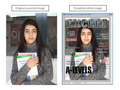
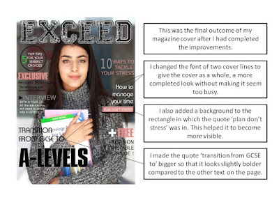
This is the final outcome of my magazine front cover and contents page.
I feel that they work well together because they have the same colour
scheme and also some more subtle links between each other. I have looked
at real media texts, analysing them to pay attention to detail and incorporate
professional ideas into my own work. I picked out certain aspects of real
magazines which I liked and then added them into my own magazine adding
small improvements along the way. I chose this colour scheme in relation to the image of my model. (e.g. the pink from her lips or the green from the book). I found that relating everything back to the image helped it come together as
a whole and look as professional as possible.

PRELIM TASK: Contents Image Choices


PRELIM TASK: Contents Layout Decisions


Monday, 21 September 2015

PRELIM TASK: Reader Profile

Hi, my name is Anna. I am 16 years old and I have started my A levels in year 12 at Norbury Manor Sixth Form. I am studying Maths, RS, Art and Psychology. I am quite an academic student however, I also have a very creative side as I love art. I have a very heavy workload and many deadlines to keep up with which often causes me stress. I tend to deal with this stress through art as it relaxes me and allows me to express myself. It helps but is not always effective so I would love to have some advice on other ways to deal with the stress of school.

I sometimes also struggle with motivation to study as revising the same thing over again from a book can get quite boring. I think it would be very helpful to learn about more interesting and effective revision techniques which perhaps are more active so that I wont get bored easily but at the same time I would be revising effectively.

The jump from GCSE's to A levels is huge which makes it difficult for me to settle into my subjects. I would like advice on how to manage my time so that I can focus on all my subjects equally but still have some free time each week. I am managing okay at the moment but some extra guidance would be much appreciated.

PRELIM TASK: Teen Vogue Magazine Deconstruction

Teen Vogue Magazine Deconstruction

Friday, 18 September 2015

PRELIM TASK: My Initial ideas

Hi! Welcome to my AS media studies blog. My name is Aamina and I am studying Art, Media and English Literature. Here I will be posting and updating my progress towards my project which is to create a school/college magazine front cover and contents page. This will be aimed towards students who have began the transition between GCSE's and A-levels. I understand the layout and features of a good magazine front cover which I am confident in designing as I feel that I can incorporate my creativity into it.

I am not completely confident about the more technical aspects of this project as I haven't had much practice in blogging however I will try my best to understand features which I haven't used before. I look forward to adding to this blog and learning new things along the way.